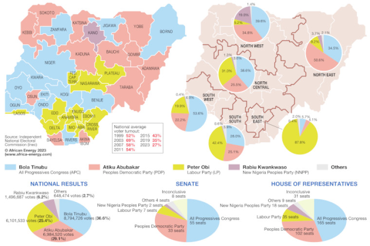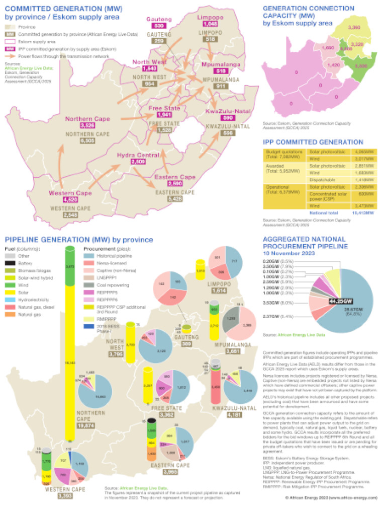
This graphic collects together a series of maps and charts illustrating South Africa's power generation pipeline.
Two main maps of South Africa show committed generation (MW) by province/Eskom supply area (including power flows through the transmission network), and pipeline generation (MW) by province (including fuel breakdown and pies showing procurement route).
A smaller map shows generation connection capacity (MW) by Eskom supply area. Also included is a table showing IPP committed generation and a pie showing aggregated national procurement pipeline.
The main data source is African Energy Live Data.
Access via a report
Subscribe to African Energy
African Energy is a brand of