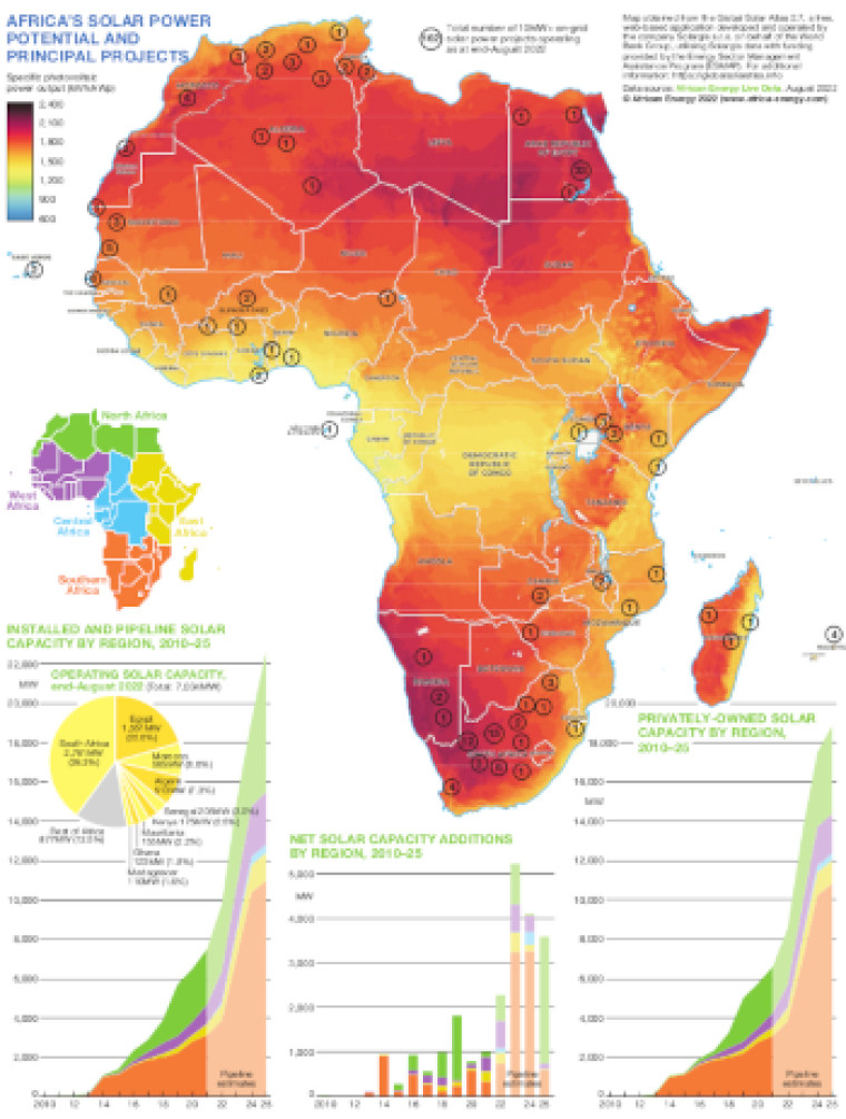
This map use datasets from African Energy Live Data to illustrate Africa's solar power potential and principal projects. A main map is shaded according to specific photovoltaic power output, with the location of operating on-grid solar power projects (100MW+) marked.
Charts below the map show installed and pipeline solar capacity by region (2010-25), a breakdown of operating solar capacity by country, net solar capacity additions by region (2010-25) and privately-owned solar capacity by region (2010-25).
Subscriber only content
An active subscription is required to view this article
Subscribe to African Energy
African Energy is a brand of